99 Food is a delivery company that arrived to reshape the Brazilian market.
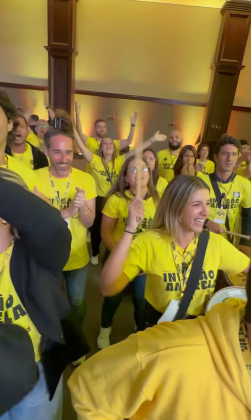
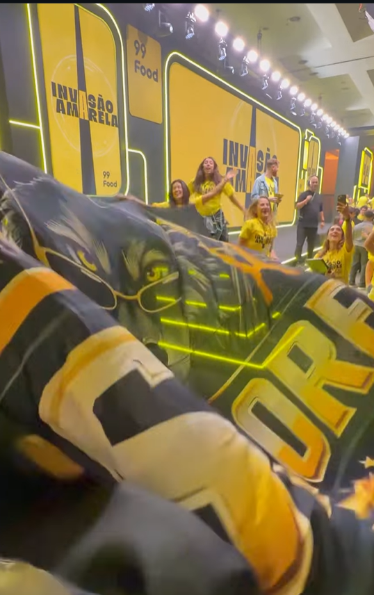
For the event’s visual identity, the naming “Yellow Invasion” reflects the brand’s rapid growth across the country and serves as an aggressive, bold concept for the sales convention.
For the event’s visual identity, the naming “Yellow Invasion” reflects the brand’s rapid growth across the country and serves as an aggressive, bold concept for the sales convention.
Creative Direction
Concept & Audivisual
Agencia Smash!
2025
Concept & Audivisual
Agencia Smash!
2025

The logotype is built on a robust, condensed typeface, conveying strength, solidity, and immediate impact. The letterforms carry strong visual weight, creating a brand that asserts itself with confidence.
A central vertical cut crosses the composition as an element of rupture and reveal. It symbolizes the moment of invasion — slicing through space and unleashing yellow as the main protagonist. This gesture adds visual tension, dynamism, and reinforces the idea of transformation and shift.
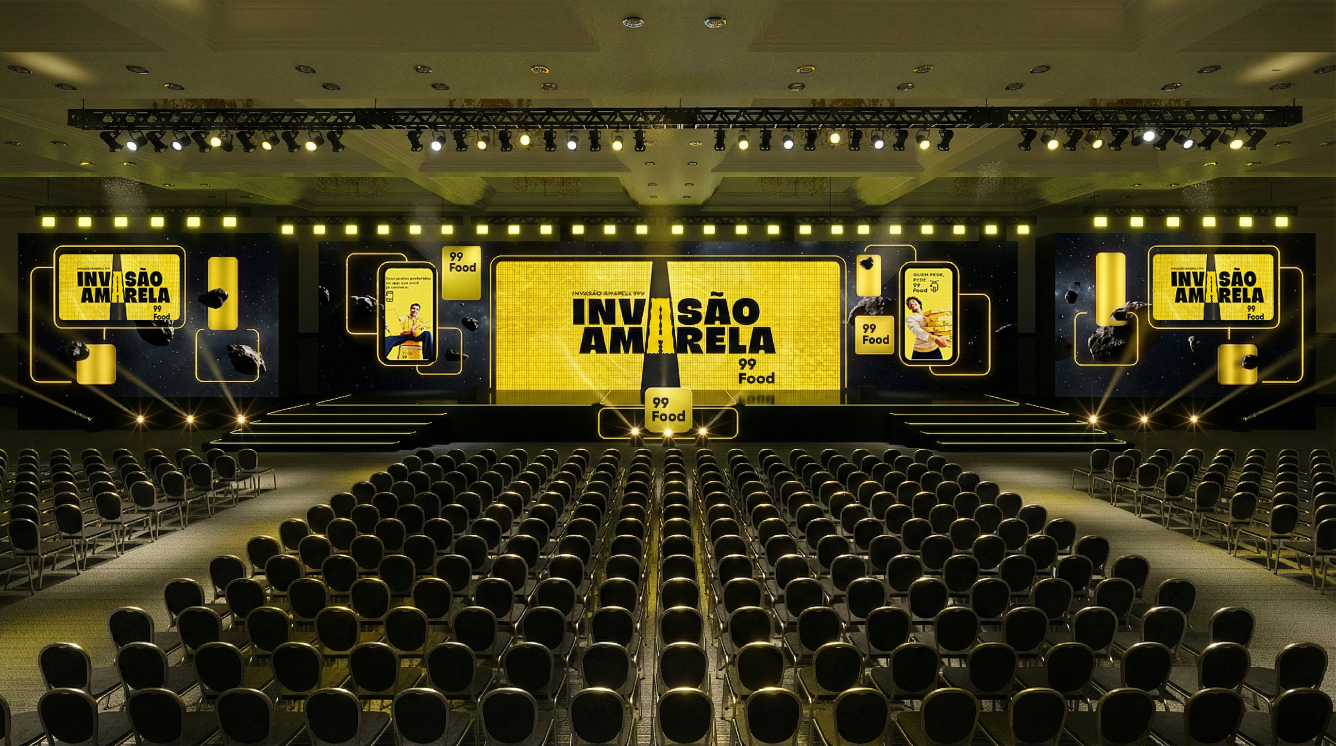


The motion design was conceived as an experience of impact and spatial dominance, with typography as the main narrative driver. The progressive entrance of the letters builds tension and anticipation, leading to a decisive turn where yellow takes over — a visual explosion of identity, energy, and presence.
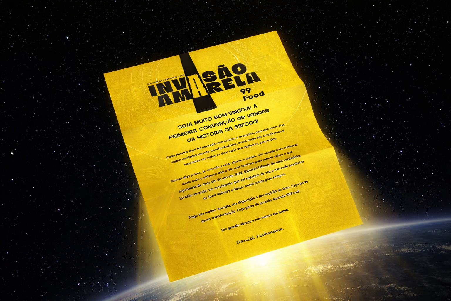
Yellow is the core asset of the system, representing energy, visibility, attitude, and action.